Elements:Cards
Examples
Card are super flexible content containers which can have a header/title, image, content, footers, lists, links and more.

Card title
Some quick example text to build on the card title and make up the bulk of the card's content.
Go somewhereCard with image in middle
And a subtitle
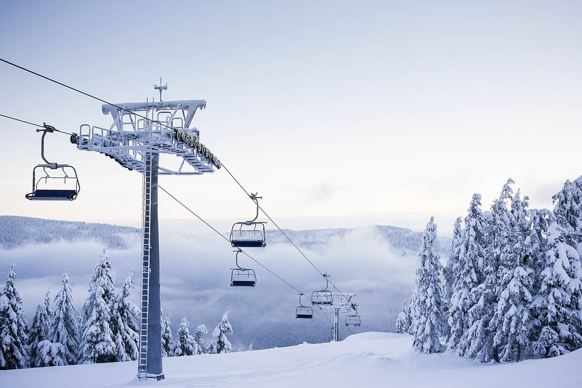
Some quick example text to build on the card title and make up the bulk of the card's content.
Go somewhereCard with list-group
Some quick example text to build on the card title and make up the bulk of the card's content.
- Cras justo odio
- Dapibus ac facilisis in
- Vestibulum at eros
Card content
Cards support a huge array of content and define their own helper classes for content.
.card-body
This class allows you to add padding to either the whole card or blocks of content within a card. This is really useful if some content needs to stretch to the edges (like images) and some not (like text).
.card-header +
.card-footer
These classes apply padding, a background colour and border radias properties to the card header or footer, useful for capping the top & bottom of a card.
.card-header can also be applied directly to an
h badge element to apply a similar effect.
.card-title
This simply applies a bottom margin to an item which should be considered the title of the card.
.card-text
This applies no effect on default cards and is only used when using the
.card-inverse class (below).
.card-header-tabs +
.card-header-pills
These classes should be applied to navigation elements should in the card header.
List groups
.list-group-flush
This class allows you to include list groups within cards and have them stretch to the edge of the card.
Card images
Images can be added to cards either at the top, middle, bottom or even as a background image.

Card image top
Some quick example text to build on the card title and make up the bulk of the card's content.
Go somewhereCard image bottom
Some quick example text to build on the card title and make up the bulk of the card's content.
Go somewhere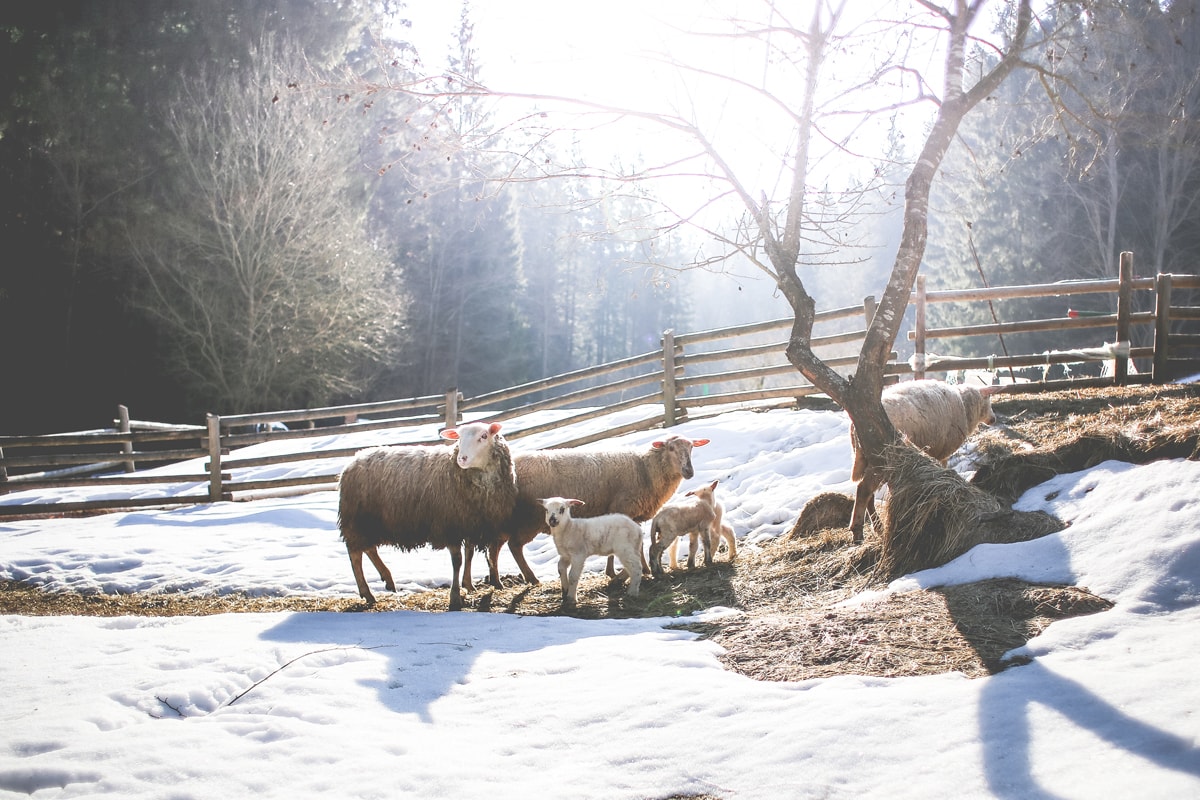
Card image middle

Some quick example text to build on the card title and make up the bulk of the card's content.
Go somewhere
Card Content Alignment
Cards support the standard text alignment utilities:
.text-BREAKPOINT-ALIGN
Default alignment
With supporting text below as a natural lead-in to additional content.
Go somewhereCenter alignment
With supporting text below as a natural lead-in to additional content.
Go somewhereCard Ribbons
You can apply a ribbon to the corners on cards which can be useful to highlight a specific card.
HTML: View code example
<div class="card-ribbon card-ribbon-VERTICAL-ALIGN card-ribbon-HORIZONTAL-ALIGN ANY-HELPER-CLASSES">SHORT TEXT</div>.card-ribbon-VERTICAL-ALIGN can be top or bottom,
card-ribbon-HORIZONTAL-ALIGN can be left or right.
You can use the colour utilities to control the background colour & text colour of the ribbons. NOTE: Ribbons do not work with "Cards Columns" below.
Ribbon
With supporting text below as a natural lead-in to additional content.
Go somewhereRibbon
With supporting text below as a natural lead-in to additional content.
Go somewhereCard Styles
Background colours
Apply solid background colours to cards, use in conjunction with the
card-inverse or the text colour utilities.
.card-primary
Ad eligo eros haero ibidem inhibeo iriure pertineo ratis zelus.
.card-secondary
Abico antehabeo cui decet facilisi haero probo quae.
.card-info
Abluo bene caecus defui nulla rusticus saepius venio.
.card-success
Aptent neo quae. Inhibeo magna quidem.
.card-warning
Minim secundum suscipere. Adipiscing euismod ibidem importunus inhibeo iusto luptatum quibus quidne suscipit.
.card-danger
Exerci letalis suscipit tum. Abdo caecus erat mos venio.
.card-dark
At meus mos quadrum roto sagaciter verto vulputate.
.card-light
Aptent dolor humo imputo nibh praemitto validus vulpes.
Outline colours
Apply an outline colours to cards with these classes.
.card-outline-primary
Lobortis similis sit ymo. Exputo patria pneum roto.
.card-outline-secondary
Feugiat hendrerit metuo praemitto proprius vero virtus.
.card-outline-info
Abluo aptent at autem bene enim gravis iriure uxor.
.card-outline-success
Ad et exerci immitto natu suscipere tum.
.card-outline-warning
Appellatio distineo eu eum hendrerit meus modo oppeto virtus.
.card-outline-danger
Damnum exerci illum loquor oppeto pneum valde.
.card-outline-dark
Patria roto turpis valetudo. Dolus occuro utinam.
.card-outline-light
Oppeto premo torqueo. Consequat eu gravis iaceo importunus lenis refoveo ymo.
Background Shadow
The
bg-shadow class can be used on cards to give a background shadow effect.
Background Shadow
With supporting text below as a natural lead-in to additional content.
Go somewhereClickable Cards
To make a whole element or card clickable to a url, simply add
data-url="URL" and it will make the whole element or card act link a link.
Cards Grids
Cards can be laid out using the grid system built into Bootstrap.
Cards Groups
Groups will force all cards to be displayed on the same row as well as be the same width and height.
Simply wrap your card elements within a
.card-group wrapper like this:
<div class="card-group">...cards.....</div>

Card title
This is a wider card with supporting text below as a natural lead-in to additional content. This content is a little bit longer.
Last updated 3 mins ago

Card title
This card has supporting text below as a natural lead-in to additional content.
Last updated 3 mins ago

Card title
This is a wider card with supporting text below as a natural lead-in to additional content. This card has even longer content than the first to show that equal height action.
Last updated 3 mins ago
With aligned footers
If cards contain
.card-footer elements they will automatically get pulled to the bottom and aligned with the other card footers.

Card title
This is a wider card with supporting text below as a natural lead-in to additional content. This content is a little bit longer.

Card title
This card has supporting text below as a natural lead-in to additional content.

Card title
This is a wider card with supporting text below as a natural lead-in to additional content. This card has even longer content than the first to show that equal height action.
Cards Decks
Card decks work much like groups expect the cards are not attached to each other.
Card decks require 2 wrapper elements like this:
<div class="card-deck-wrapper"><div class="card-deck">...cards.....</div></div>

Card title
This is a longer card with supporting text below as a natural lead-in to additional content. This content is a little bit longer.
Last updated 3 mins ago

Card title
This card has supporting text below as a natural lead-in to additional content.
Last updated 3 mins ago

Card title
This is a wider card with supporting text below as a natural lead-in to additional content. This card has even longer content than the first to show that equal height action.
Last updated 3 mins ago
With aligned footers
Like card groups if cards contain
.card-footer elements they will automatically get pulled to the bottom and aligned with the other card footers.

Card title
This is a wider card with supporting text below as a natural lead-in to additional content. This content is a little bit longer.

Card title
This card has supporting text below as a natural lead-in to additional content.

Card title
This is a wider card with supporting text below as a natural lead-in to additional content. This card has even longer content than the first to show that equal height action.
Cards Columns
Cards can be set to display in Masonry-like columns just by adding a wrapper with the class
.card-columns .

Card title that wraps to a new line
This is a longer card with supporting text below as a natural lead-in to additional content. This content is a little bit longer.
Lorem ipsum dolor sit amet, consectetur adipiscing elit. Integer posuere erat a ante.

Card title
This card has supporting text below as a natural lead-in to additional content.
Last updated 3 mins ago
Lorem ipsum dolor sit amet, consectetur adipiscing elit. Integer posuere erat.
Card title
This card has supporting text below as a natural lead-in to additional content.
Last updated 3 mins ago

Lorem ipsum dolor sit amet, consectetur adipiscing elit. Integer posuere erat a ante.
Card title
This is a wider card with supporting text below as a natural lead-in to additional content. This card has even longer content than the first to show that equal height action.
Last updated 3 mins ago


